

As website owners, marketers, and content creators, we’re publishing millions of content pieces on the web every day. But for people with disabilities, accessing web content can be difficult, if not impossible.
Also, more and more people are accessing websites exclusively on mobile devices.
So, the question arises: how can you make a website accessible to anyone?
But the good news is all these can be easily taken care of! You can easily make your web content accessible to a wide range of users, including those with disabilities or mobile devices with relatively smaller screens.
In this blog post, I’ll share tips and guidelines on how to make web content accessible to everyone. Following these guidelines, you can help make the web a more inclusive place — a web for everyone, if you will!
This write-up is focused on creating & writing accessible web content and is targeted toward bloggers, content writers, copywriters, marketers, SEOs, solopreneurs, and (to some extent) designers.
That’s why coding or web design accessibility guidelines complying with WCAG or other standards have not been covered here.
Web Accessibility Standards & WCAG
When it comes to the internet, accessibility is key. Whether you’re looking to create a website or develop web-based applications, it’s important to consider how your content will be accessed by those with disabilities.
With that goal in mind, The World Wide Web Consortium (W3C) has established a set of guidelines known as the Web Content Accessibility Guidelines (WCAG). These guidelines cover a range of topics, from the structure of web pages to the use of images and multimedia, to make web content more accessible for everyone!
While creating accessible web content can seem like a daunting task, following these guidelines can help ensure that your content is accessible to everyone.
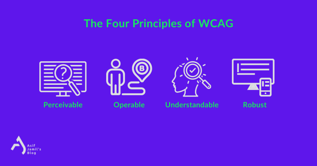
The Four Principles of WCAG
The web accessibility standards and guidelines of WCAG stand on 4 core principles. All of these principles have one common goal — building an accessible and inclusive web for everyone.
The WCAG principles of accessibility are —
- Perceivable: Web content must be able to be perceived and identified by all users, regardless of their sensory abilities.
- Operable: Web content must be easy to use and navigate for all users, regardless of their physical or cognitive abilities.
- Understandable: Web content must be easy to understand for all users, regardless of their level of education or expertise.
- Robust: Web content must be accessible to all users, regardless of the technology they use.
Having these principles and the latest WCAG guidelines at heart, let’s move on to the ultimate web content accessibility checklist for all forms of content creators and website owners of the 21st century
Steps to Create Accessible Web Content
1. Add Meanings to Thy Texts
Ah, text — the good ol’ form of content we don’t talk about anymore, thanks to his cool new friend called video!
But seriously though, when creating content or just about anything on the web, texts are literally unavoidable. So, it’s a no-brainer that text should be the first area of focus for ensuring content accessibility.
Whether you’re writing blog posts/website copies, designing webpages, or creating marketing material on the web, keep this list in check to make the text content accessible for everyone:
1.1 – Optimal & Visible Font
Small font sizes may hamper the readability of your text for visually impaired visitors to your website. Also, going for a fancy cursive font may seem cool but has the potential to upset people with reading disabilities. So, it’s wise to be visually inclusive by choosing typefaces and font sizes that make reading easier.
It’s always better to stick to the common fonts. Otherwise, people with certain language-based learning and cognitive disabilities may have a hard time recognizing similar characters such as uppercase “I” (e.g. Invade) and lowercase “l” (e.g. love).
1.2 – Text Backgrounds Matter!
Picking an optimal and accessible font will mean nothing if you don’t have a background that complements the text. To make your text stand out in front of your readers, always use a dark font on a light background or vice versa. Otherwise, the lack of contrast will turn the text unreadable.
Also, remember to avoid using busy/cluttered backgrounds that make the text difficult to read. Simplicity is the key, right?
Maintaining this will prevent trigger events related to ADHD and ensure the accessibility of your text content for the better.
1.3 – We Need Some Space!
Evidently, spacing also matters — be it in between words, sentences, paragraphs, or even sections. Squeezed texts and narrow blocks make for a disastrous reading experience for people with or without disabilities and limitations.
Speaking of spaces, using the “justified alignment” is often discouraged due to the uneven and off-putting spaces they produce. So, you might want to keep away from that as well.
The points above, as well as the usual best practices of text content on the web, will help you provide accessibility for your visitors.
Learn the most common mistakes content writing mistakes to avoid
2. Alternative (alt) Text for Media
The alternative text/alt text is an attribute for images inserted in the HTML code. It is a word, phrase, or a sentece that tells viewers the nature or contents of the image.
Why add alt text to images?
Here’s why:
✅ The alt text of an image is shown as a replacement when the image is unavailable or missing
✅ Alt text helps to add accurate context/descriptions of your images to search engine crawlers, helping them index, and rank the images properly in relevant image search queries.
✅ Alt texts ensure better accessibility of your content by complying with the web content accessibility guidelines from W3C.
And why is alt text important for accessibility?
Well, alt texts allow screen readers to meticulously describe images to the users who either can’t see the image or have difficulty perceiving them.
That’s why it’s crucial to provide alternative text (alt text) for images and other media. This way, people with visual impairments can still access and understand the content on your website.
How to add alt texts to images and ensure accessibility?
Glad you asked! ⤵️
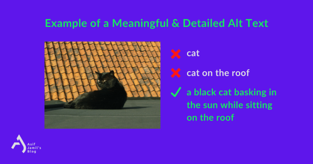
2.1 – Meaningful & Detailed
As we’re aiming to provide a media alternative, alt texts demand proper meanings. They should be structured as full-fledged sentences or phrases that are understandable to everyone.
Also, you should incorporate as many details as possible to draw a vivid picture for the reader/listener. Remember, this text will serve as an alternative. So, the more info it holds, the better it serves the purpose.
So instead of a half-baked alt text like “cat on the roof” or just simply “cat”, a meaningful and descriptive alt text would be “a black cat basking in the sun while sitting on the roof”.
Please note that among all possible details to include in an image alt text, you should prioritize the ones relevant to the context and also the possible keywords you want to target.
2.2 – Proper Formatting
Aside from the details, It’s equally important to ensure that the alt text is properly formatted so that it can be read by screen readers. This means using proper punctuation and capitalization wherever needed. Grammatical accuracy should also be kept in check while writing alt texts.
2.3 – Avoiding Unnecessary Words
People often add things like “image” or “video” to alt texts that are usually automatically generated by the screen reader. As a result, the added indication of the media file becomes irrelevant.
For the above example, adding something like “image of a black cat basking in…” would be unnecessary and redundant.
3. Transcripts & Captions for Media
This one is obvious — not everybody can hear the audio or watch the video on your website. So, you have to ensure their accessibility while uploading such media files.
The fix?
- Add transcripts to your audio files
- Add closed captions (CC) to your video files
(Make sure the CC is perfectly synced to the video file. Also, manual reviews should be done for automatically-generated closed captions.)
By doing this, your media files will be ready to be consumed by people who have difficulty seeing video content or listening to certain types of sounds.
Subtitles, in general, consist of dialogues and speeches. On the other hand, closed captions include the written description of other sounds and noises from the ambiance, surrounding environment, props, etc.
If you’re using WordPress, then you can use the Web Video Text Tracks Format (WebVTT) feature available to version 5.6 and later for captions and subtitles. By adding VTT files, you can easily ensure the accessibility of your video files in WordPress.
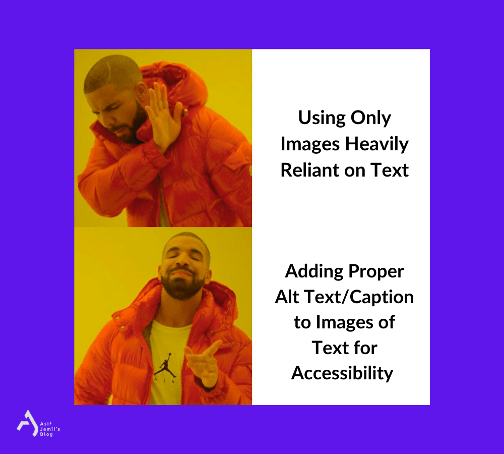
4. Best Practices for Images of Text
It’s simple — when you add an image that contains text, some people can’t read it, which is an accessibility red flag
In order to avoid this situation, you can follow these —
- If an image containing text can be replaced by plain and simple text content, consider going for it.
- If the image containing text is unavoidable, add a descriptive and precise alt text to the image that conveys the same message.
- Another way of dealing with this is doing both. That means, adding an image with text side-by-side with complementary text content as well.
5. Titles and Headings in Check
Clear and concise titles and headings guarantee a more inclusive webpage for your visitors. That way, people with cognitive disabilities can easily understand your content and navigation.
Here’re some tips on how you can create accessible titles and headings:
- Use descriptive titles that accurately reflect the topic of your content. They should be meaningful, unique, and relevant — leaving no room for confusion.
- Use headings in a standard format to structure your content and make it easy to scan. H1-H6 tags should be implemented properly and hierarchy should be maintained with care.
- Avoid using jargon or technical terms in your titles and headings. You should use simple and straightforward language that’s understandable to everyone.
- Section headings should be descriptive and helpful for breaking long content into shorter sections while keeping the original meaning intact.
- All pages should have a title. Also, H1 should only be used once throughout a page.
Keeping these pointers in check will help you make your web pages more accessible.
6. Proper Contrast of Colors
One important aspect of creating accessible content is ensuring that there is enough contrast between the text and background colors. This helps website visitors who have vision impairments and may have difficulty reading text if the colors are too similar.
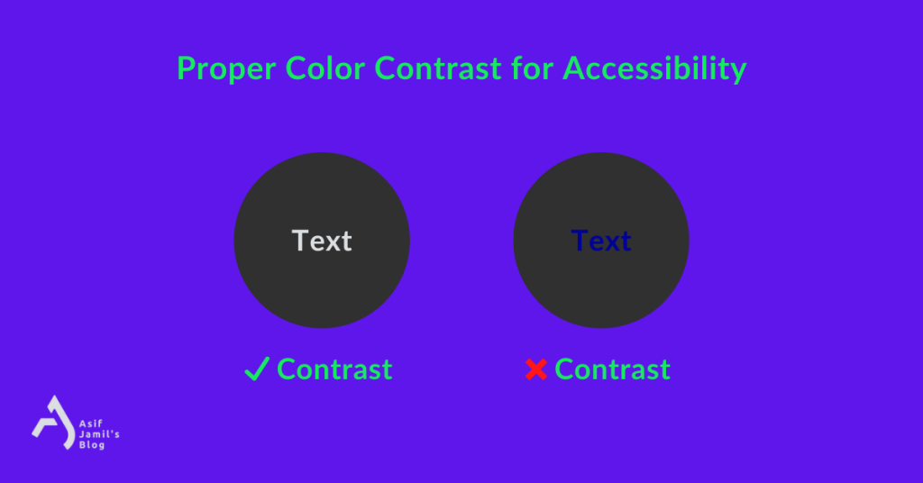
There are a few different ways to ensure sufficient color contrast.
The first is to use contrasting colors between the background and the foreground. That is, you have to go for a dark text color and a light background color, or vice versa.
Another option is to use a larger-than-usual font size (but within the aesthetic range, not too large to make it ugly) for the text.
Finally, you can use a contrasting border around the text, or in other words, strokes in your text.
Professional designers already follow these while designing. But non-designers may find this list helpful to ensure accessibility in their web content.
7. Full Accessibility via Keyboard
Not all people have the same level of motor skills or fully-functional hands. For them, using a mouse with computers or navigating by touching the screen is a nightmare.
One way to guarantee their accessibility is by optimizing the navigation of your website for keyboard operations. This includes:
✅ Assigning the Enter/Return key to clicking the element in focus
✅ Assigning the Tab key for jumping between elements in a page that are selectable
✅ Making sure all form fields are usable with the keyboard
✅ Ensuring keyboard navigators can see the element in focus with an appropriate focus state
✅ Checking if there’s any keyboard trap or keyboard loop
✅ Giving users the freedom to skip content and return to the top of the page comfortably using only the keyboard
For more on the accessibility of keyboard navigation, refer to this link.
8. The Curious Case of Emojis
Writing accessible web content in the modern era is often tricky.
Take emojis for example. There is no definitive guideline on how to handle emojis for accessibility. But, there are a few best practices you can follow.
But first, let’s understand how screen readers perceive emojis. Screen readers read emojis via a Unicode string, which is kind of like alt texts. So, although they’re technically readable, you have to know your way around them for accessibility.
Also, people with visual impairment and old people have a hard time distinguishing one emoji from the other, especially when used as long strings of emojis.
On that note, here’s how to ensure the accessibility of emojis:
- Use emojis sparingly. Excessive use of emojis can interrupt the overall experience of the readers using the help of screen readers. Also, try to refrain from using multiple emojis in a row (e.g. ) which is a nightmare for people trying to read via listening to them.
- Don’t replace words with emojis. Yes, emojis do have alt texts. But most of the time, they won’t convey the same message as their text counterparts. Besides, evolved meanings of emojis (e.g. , ) may lead to misinterpretation when you use them to replace actual words.
- Use emojis at the end or the beginning. Putting them in the middle of sentences often arise confusion among screen readers. So, it’s best to put them in between two sentences.
- Only emojis, no emoticon! While emojis are widely accepted and have alt texts of their own, emoticons like “:(” or “:D” don’t. So, a lot of people won’t get what you’re trying to say.
- Beware of emoji colors! Keep in mind the color of the emoji in use as well as its background. The lack of contrast between them will hinder people from seeing them clearly.
9. Filling Forms with Ease
It’s impossible to think of the internet and the websites of today without forms. Being a must-have for every type of website, the accessibility of forms is something we just can’t afford to ignore!
Here are the ways to make online forms accessible:
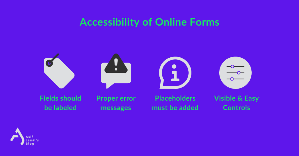
9.1 – Fields Must be Labeled
Online forms consist of different kinds of fields. For people reliant on screen readers and for others having accessibility issues, labeling fields is essential. Simply adding labels won’t be sufficient — the labels should accurately depict the purpose and the use of the field.
For form fields without visible labels, “aria-label” should be used.
Lastly, it goes without saying that labels should be directly adjacent to their respective form field.
9.2 – Errors & Warning Messages
Descriptive and detailed warning/error/verification messages should be added to form fields wherever necessary. The message must also include the process to get rid of the issue. This way, all sorts of users will be able to identify their issues while submitting the form. Adding these messages will ensure the inclusivity of the online form.
9.3 – Add the Placeholders Correctly
Examples are always helpful, especially when you are dealing with disabilities. Adding placeholder texts to the form fields are those examples that draw a vivid picture of what to expect from that form field. That’s why it’s considered to be an accessibility best practice.
9.4 – Visible and Convenient Controls
When creating forms, it’s mandatory to check if all form controls are clearly visible and easy to click/select. Form controls and form navigation should be so simple that even the users with limitations don’t find any difficulty adjusting the form elements.
10. Accessibility in Menus
Menus are the gateways to your website — providing smooth navigation throughout the realm. That’s why making sure your website’s menus are accessible is a must.
- Make sure all of your menu items are labeled clearly. This will help people with visual impairments understand what each menu item is.
- Menus should also be easy to navigate. This means ensuring they’re easy to find and that users can move through them easily.
- Your menus should be compatible with assistive technologies like screen readers. This will help people with disabilities access your content.
- For drop-down menus, keep in mind that people might have limited motor control for navigating through them. So, it’s best to keep drop-down menus simple without adding too many levels.
- For people with unsteady hands, drop-down menus can be a hassle if they appear and disappear instantly. Consider adding a time delay to the drop-downs and mega menus for accessible use.
- There are people who can’t use a mouse and as a result, rely on the keyboard for navigation. For being inclusive, your drop-down menus and mega menus should be keyboard-ready — responsive to the tab key and the enter key for traversing.
- For blind users and their screen reader apps, your drop-down menus should be formatted as an unordered list of links.
These actions to make menus accessible will suffice for starters.
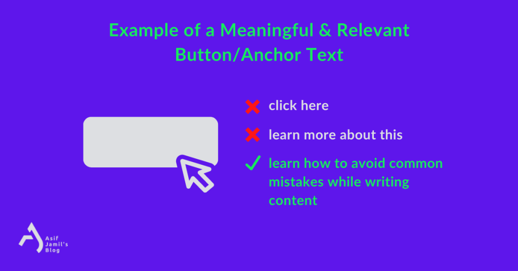
11. Links, Anchors, and Buttons
The three names a website is incomplete without — links, buttons, and anchors. Considering just how often they’re used, it’s impossible to think about web accessibility without taking steps for them.
To ensure web content accessibility for anchors, buttons, and links, you can follow these —
Anchors must have content and the content must be accessible by a screen reader
Link text and anchor text should be relevant, intent-driven, and meaningful. So, instead of “learn more” or “click here”, an accessible link text would be “learn how to avoid mistakes while writing content” with the link to the desired page.
When linking to images, make sure they contain alt texts.
Links should appropriately look like links. There should not be any design mishaps or shady cloaking of links.
Components like links and buttons with the same functionality or purpose should be identified and labeled with consistency.
Consider using a unique aria-label attribute to links if link texts are similar and can’t be made unique/contextualized.
If a link redirects the user to a file, declare it clearly. Don’t hide it in the link text or aria-label.
12. Using Multiple Languages
When a website uses multiple languages on its pages, it has the potential to be an accessibility nightmare. But this can be prevented easily
- When a webpage contains multiple languages, use HTML markup and a “lang” attribute to indicate the change of language inside the content.
- If there’s a toggle/switch for the language change, make sure you’re using HTML code for the implementation.
- Whether you’re using multiple languages or not, it’s best if you add a “lang” attribute to your HTML code of the page. For example:
/*<html lang="en">
/*<html lang="de">
Here, en and de indicate English and German languages respectively.
13. Flickering/Flashing Content
Using content or element that flickers, blinks, or flashes repeatedly is never a good idea. WCAG has strict guidelines on using such content, especially the ones flashing/flickering more than three times a second (greater than 3 Hz). Doing the opposite can trigger/obstruct website visitors who have —
- ADHD
- Sensitivity to light/motion
- Photosensitive epilepsy
- Other cognitive disability/impairment
To test if your content can trigger photosensitive epilepsy, you can use this free PEAT Tool. It can help you detect if any element or content can lead to seizures for people with photosensitive epilepsy.
14. Making PDFs Accessible
When it comes to web content, PDFs can pose a particular challenge. PDFs have a long-standing reputation for not being accessible to people with disabilities. This file format is notorious for often being created from scanned documents, which makes them inaccessible to a lot of people.
But there are ways to make PDFs more accessible:
- The first and oldest method is to make the PDF file OCR-friendly. If the file is scannable to OCRs, anyone can access its content regardless of their limitations or disabilities.
- You can also make tagged accessible PDF files using a library/tool like Prince. A tagged PDF document enables the assistive tech to detect what type of content is inside the PDF. That way, it’s more accessible.
See all previous content from M. Asif Jamil on topics ranging from marketing, branding, psychology, copywriting, contemporary society, WordPress, personal finance, cinema, to everything in between.
Closing Notes
As we’ve discussed above, creating accessible web content is important to ensure that everyone can access and use your site. By following the accessibility guidelines outlined in this article, you can make sure that your site is as accessible as possible.
I hope this article has helped outline some of the ways you can make your site more accessible. If you have any questions or need further assistance, feel free to leave a comment below. I’ll be happy to help/discuss!

Eхϲellent items from you, man. I really like what you’ve bought right here, гeally ⅼike what you’гe statіng and the way in which you are saying it.
Hello, I enjoy reading all of your post.
I like to write a little comment to support you.